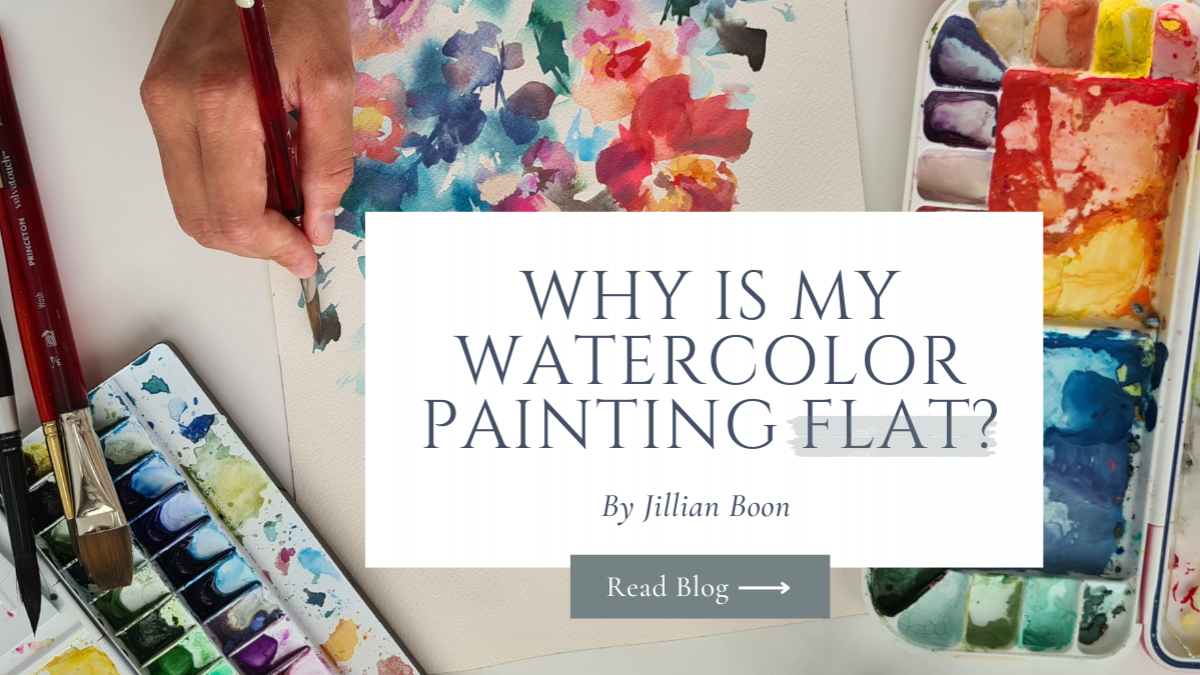
Why is my watercolor painting flat?
 Jillian Boon
Every time we paint, we are attempting to bring our 3D world into a 2D surface (your paper).
It is no wonder creating paintings that pop and have depth feel tricky and tough.
Let me share some reasons for why your painting looks flat
1. You heavily rely on 1 layer for your watercolor painting
645b385494556_lg.jpg)
While you can add as many blends to create some depth - relying heavily on 1 layer is a lot of pressure to put on yourself and your painting.
Quick tip: use your first layer as a road map for the big shapes in your painting and then slowly build layers
2. You use a lot of colors to compensate for depth
645b385dc0dbd_lg.jpg)
Colors add vibrance to a painting. But colors cannot replace depth. Depth is achieved by understanding light and shadow in our 3D world. Using too many colors in a watercolor painting can make the painting look muddy and confusing.
Watercolor is a medium that relies on transparency and layering, so when too many colors are used, it can make it difficult for the viewer to distinguish the different elements in the painting and can take away from the overall impact of the artwork.
Quick tip: match your painting to your pictures' tonal values so that you can create the illusion of depth through adding dark and light values.
3. Your objects are of the same shape throughout the painting
645b386962381_lg.jpg)
Painting everything in similar shape gives the perception that all objects in the painting are of the same distance from the viewer. When you paint the same size of the shape throughout a painting, your composition starts to feel static and unappealing. Changing the size of shapes within a painting is an effective way to create visual interest, convey movement and depth, and guide the viewer's eye through the artwork.
For example, if all the shapes in a painting are the same size, it can be difficult for the viewer to distinguish between foreground and background elements. This can result in a flat and unengaging image. By varying the size of shapes, you can create a sense of depth and hierarchy within the composition.
Varying the size of shapes can also create a sense of movement within the painting. For example, if you want to convey the feeling of wind blowing through a landscape, you might make the trees in the foreground larger and the trees in the background smaller to create a sense of perspective and movement.
Quick tip: Object sizes change as they go in the distance - our left brain tells us that objects further away are smaller and those closer to us are bigger. So add visual interest by mixing up the sizes of objects in your painting.
The 1 thing that changed the way I painted was when I challenged myself to paint with 1 color.
I painted in monochrome. I get that painting in 1 color doesn’t sound appealing but hear me out - this challenged me to use the dark and lights of 1 color by learning how to balance water ratios on my brush and painting - PLUS kept me on my toes learning how to plan my painting instead of simply jumping in.
I grew more intentional as a painter.
645b38992537a_lg.jpg)
I get that many may struggle with painting in monochrome because it can be challenging to create an engaging and dynamic image with limited color choices. Also, color is often associated with mood and emotion, and so painting in 1 color can feel restrictive and limiting.
Let me just say that painting in monochrome can be a useful exercise if you are looking to improve your understanding of value, contrast, and composition. By eliminating the distraction of color, you can focus more on the relationship between light and dark tones, which is essential for creating the illusion of depth and three-dimensional form.
When painting in monochrome, you can experiment with a variety of techniques to create the illusion of depth. For example, by using lighter values to create highlights or leaving out your white spaces on your paper intentionally. Plus, darker values create shadows. You can create the impression of light and shadow on a two-dimensional surface.
Ultimately, painting in monochrome can help you develop your understanding of value, contrast, and composition, which are essential skills for creating compelling and dynamic artwork. While it may initially feel challenging, if you persist with this technique you can start to produce some of your most powerful and evocative works.
I want to help you with creating this a reality. My workshop “From Flat to Fabulous” is designed to help you master the art of layering through painting in monochrome!
This deep dive workshop is for you if you:
- Struggle with where to layer and how to enhance your painting.
- Can’t get past your first ‘ugly’ layer and find yourself giving up mid painting
- Feel that your paintings look flat and you can’t figure out how to improve it
You can sign up for the workshop here: From Flat to Fab

One of the promises I make for all my workshop attendees is that you can ask me questions anytime after you have watched the workshop because I want you to obtain success and apply the skills. Don't limit the skills to the screen and take your paints out!
I hope to save you a seat!